Understanding Luminance Contrast
What is Luminance Contrast?
Luminance contrast is the amount of light reflected from one surface or component, compared to the amount of light reflected from another surface or component, typically expressed as a percentage. The amount of light reflected from each surface or component is referred to as the luminance reflectance value (LRV), although it is sometimes also called the light reflectance value or luminous reflectance value.
Luminance contrast should not be confused with colour contrast. For example, it’s common to see bright yellow paint used on plain grey concrete as a warning of potential hazards as it has a great colour contrast. However, yellow against grey often doesn’t provide sufficient luminance contrast to be discernible to some people with vision impairments, as illustrated in the image below.

The above image is an approximate simulation of luminance contrast with the influence of colour removed. The image on the right illustrates the lack of contrast between the yellow TGSIs and plain grey concrete, and the yellow nosing strips against the stair treads.
Image copyright © Realm Access 2025
Very few people with vision impairments have no vision at all; many have some vision and can perceive light, shade and reflections. Ensuring certain elements of the built environment are provided with sufficient luminance contrast can greatly enhance safety and legibility for people with vision impairments.
And it’s not just beneficial to people with vision impairments. Many people can benefit from thoughtful design in relation to luminance contrast including:
people who are colourblind
people who have cognitive impairments such as dementia
people with sensory and neurological sensitivities including vertigo, disorientation and seizures
people who are deaf or hard of hearing, and people who rely on visual communication such as lip reading and sign language
Building Code and Disability Standards’ Requirements for Luminance Contrast
For buildings and premises that are subject to the National Construction Code / Building Code of Australia (NCC / BCA), the Disability (Access to Premises – Buildings) Standards (often referred to as the Premises Standards), and the Disability Standards for Accessible Public Transport (DSAPT), there are mandatory requirements to provide luminance contrast to certain elements within accessible areas. These requirements include providing luminance contrast to:
Doorways
Nosing strips to stairs
Tactile Ground Surface Indicators (TGSIs)
Visual indicator strips / glazing decals
Toilet seats in accessible sanitary facilities and accessible adult change facilities
Statutory signage for sanitary facilities, areas with hearing augmentation, exits and some directional and wayfinding signage
Lift control buttons
Handrails (for public transport projects only)
Potential obstacles that abut accessways such as columns, posts, poles, seating and other furniture (for public transport projects only)
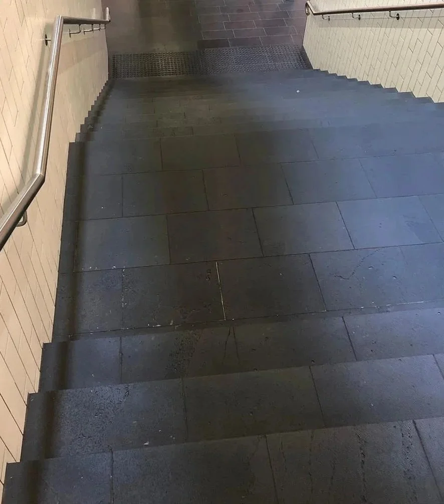
These stairs lack nosing strips. This can make it difficult to gauge where the edge of the tread is which is potentially dangerous, especially for people with vision impairments. The TGSIs also appear to lack sufficient contrast.
Image copyright © Realm Access 2025
Other Requirements for Luminance Contrast
Local governments and approval authorities often have minimum luminance contrast requirements for elements that are not subject to the NCC / BCA, the Premises Standards and DSAPT, such as to streetscapes and road infrastructure.
The NDIS Specialist Disability Accommodation (SDA) Design Standard outlines minimum luminance contrast requirements for some elements that must be met for certification of SDA dwellings:
Improved Liveability category dwellings must be provided with doorways and toilet seats with a minimum 30% luminance contrast
Robust and Improved Liveability category dwellings must be provided with visual indicator strips / decals to any glazing capable of being mistaken for an opening (the minimum contrast is not specified by the design standard but it notes the contrast is to be determined by the assessor based on their professional judgement)
The Changing Places Design Specification 2020 requires a minimum 30% luminance contrast to be provided to the facility doorway and toilet seat. It also recommends increasing the luminance contrast of all fixtures and fittings to adjacent wall surfaces.
Universal Design Considerations for Luminance Contrast
As highlighted in our post which discusses compliance with the Disability Discrimination Act – “Is it DDA compliant?” – the Premises Standards, DSAPT and the NCC / BCA do not apply to all types of premises and the requirements do not consider the full diversity of disability or the functional needs of all users. Thinking beyond the requirements set out in the Disability Standards and the NCC / BCA, and designing the built environment so it supports and enhances access and inclusion for everyone is key to meeting the intent of the DDA. Designing with consideration to Universal Design principles is one way to achieve this.
Providing certain elements within the public realm with appropriate contrast can enhance the safety and legibility of the built environment for everyone by making it easier to:
navigate through a space and understand its spatial qualities
locate, identify and use controls such as lift and door controls, intercoms, touchscreens, keypads, and lighting, power and heating controls
locate and read signage
avoid hazards
When designing the public realm, consideration should be given to providing the following elements with a minimum 30% luminance contrast:
Walls, floors, and skirting boards, including external walls and raised planter walls
Edges of paths with adjacent surfaces
Gates, including security gates and walk-throughs
Lift doors and reveals
Potential obstructions such as bollards, posts and columns
Edges of raised stages and platforms, seating tiers / terraces, and to the nosings of single steps and level changes
Seating, furniture, fixtures, equipment, information kiosks and vending machines
Joinery, benchtops, worksurfaces and service / reception counters
Light switches, GPOs and temperature controls
Handrails
Grabrails
Queuing rails
Sanitary facility fittings such as towel rails, shelves and clothes hooks
Toilet seats and flushing controls within all sanitary facilities
Taps and faucets / spouts
Door handles and/or backing plates, and other door hardware such as locks and snibs
Joinery, drawer and cupboard handles
Intercoms, keypads and touchscreens
Non-statutory signage such as room identification signage, wayfinding signage and maps, interpretive signage and exhibition displays
Contrast can also facilitate visual communication for some users who are deaf or who are hard of hearing. As highlighted by the DeafSpace Guidelines developed by architect Hansel Bauman and Gallaudet University, sign language is best viewed against a backdrop that contrasts with human skin colours but that limits the contrast within the backdrop itself. A backdrop with too much contrast, such as a heavily patterned wall, can produce a ‘visual noise’ that can be disorientating and a potential cause of eyestrain that can lead to loss of concentration for visual communicators and even physical exhaustion.
Minimising contrast can be beneficial in other circumstances. High contrasting geometric patterns, shapes, stripes and banding can potentially trigger a number of negative reactions including vertigo, seizures, visual confusion, disorientation and over-stimulation. A common known example is that pavements with strongly contrasting patterns can be confusing for some people with vision impairments and cognitive impairments; dark tiles or bands can be read as level changes or holes in the pavement which can lead to people becoming uncertain and hesitant about continuing, or worse, unstable.

The high contrast of the stone setts may make this pavement pattern appear to be undulating to people with cognitive impairments, and may be visually confusing to people with vision impairments.
Image copyright © Realm Access 2025
Eliminating contrast entirely can also be beneficial. In dementia care facilities, ensuring that certain doorways are less identifiable can be helpful, for example in minimising residents attempting to access staff-only areas and storerooms and becoming frustrated because they have encountered a locked door.
Luminance Contrast Testing Requirements
Testing procedures are outlined in Appendix B of AS 1428.1 (of both the 2009 and 2021 revisions) and Appendix E of AS/NZS 1428.4.1 (2009). These testing procedures are essentially equivalent however Appendix E of AS/NZS 1428.4.1 provides additional commentary about luminance contrast specific to TGSIs.
Two testing methods are described:
The non-contact or ‘laboratory’ method that uses standardised illumination conditions and can be carried out both on-site and off-site in an office setting or wherever building elements or samples to be tested are located
The contact or ‘on-site’ method that is carried out under the prevailing lighting condition(s) of a site and is also applicable to testing elements that are not uniformly coloured
Testing of elements may be required when they are both wet and dry, for example where stair nosings and TGSIs are located outdoors and are exposed to rain. Porous materials such as concrete and stone can become significantly darker when wet which can greatly impact luminance contrast results and affect compliance.
Many manufacturers and suppliers provide the mean light reflectance values (LRVs) for their products, however there are a number of materials that have surface variations within each material and between batches, such as timber, stone and concrete, which cannot be assigned an LRV without testing the finished installation.
Realm Access provides LRV testing services and luminance contrast assessments. During the design phase we can test samples to provide peace of mind the proposed finishes will achieve a compliant contrast. We also provide testing of as-constructed works for final compliance sign-off, as well as testing of existing buildings and infrastructure as part of building accessibility appraisals and access audits.
If you already have the LRVs for your samples, we have a free luminance contrast calculator on our website.
And if you would like further information or a quote for luminance contrast testing for your project, please do not hesitate to contact us.
21 May 2025